2 of

You are browsing the full text of the article: Typography, Teacher of Languages


Click here to go back to the list of articles for Issue: Volume: 1 of Industrial Arts


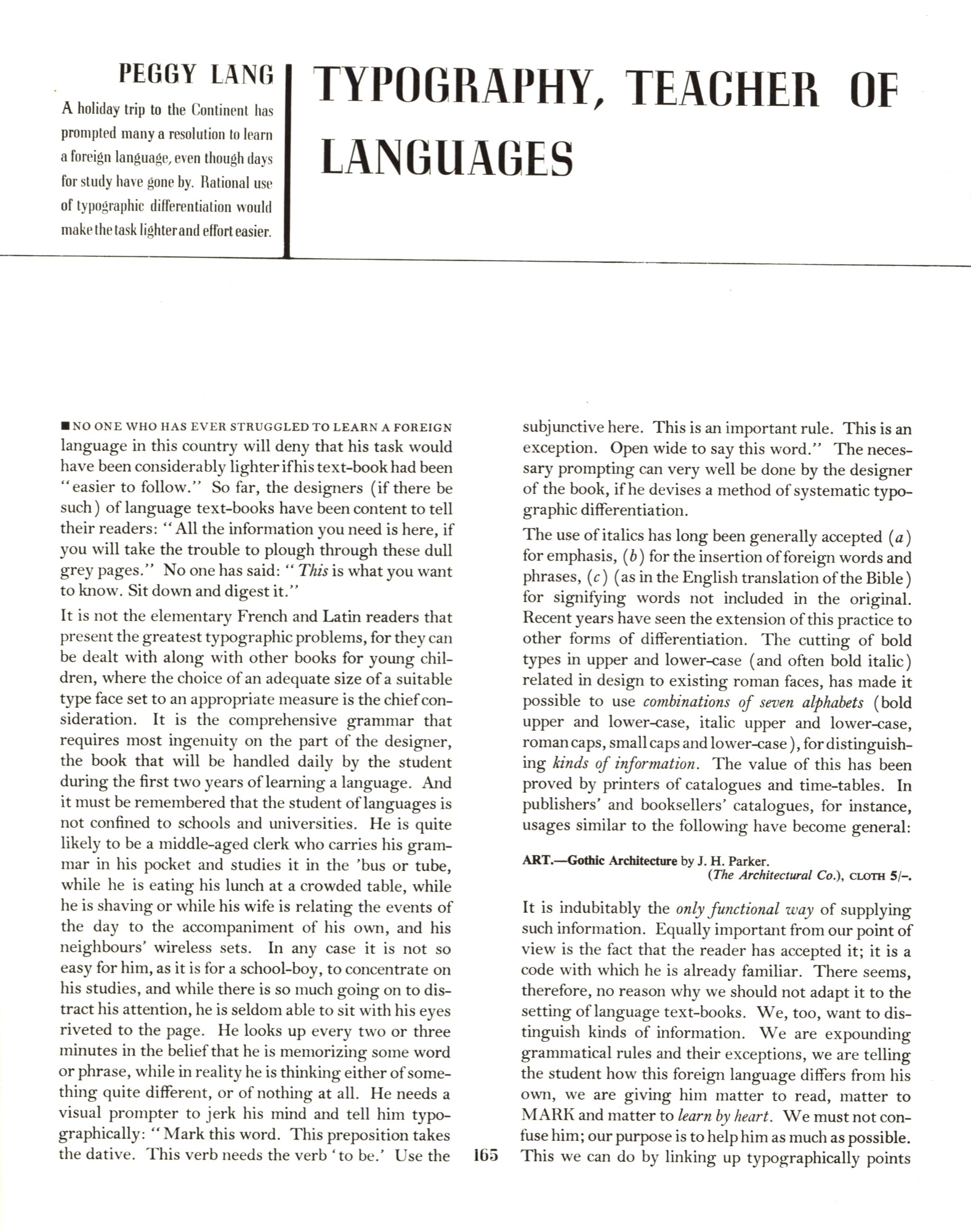
Industrial Arts  Volume 1   Issue: 2  Summer 1936  Page: 165
 
Typography, Teacher of Languages By Peggy Lang
Zoom:
100% 200% Full Size
Brightness:
Contrast:
Saturation:
 
TYPOGRAPHY, TEACHER OF LANGUAGES

PEGGY LANG
 
A holiday trip to the Continent has prompted many a resolution to learn a foreign language, even though days for study have gone by. Rational use of typographic differentiation would make the task lighter and effort easier.

* * *


NO ONE WHO HAS EVER STRUGGLED TO LEARN A FOREIGN language in this country will deny that his task would have been considerably lighter if his textbook had been “easier to follow.” So far, the designers (if there be such) of language textbooks have been content to tell their readers: “All the information you need is here, if you will take the trouble to plough through these dull grey pages.” No one has said: “This is what you want to know. Sit down and digest it.”

It is not the elementary French and Latin readers that present the greatest typographic problems, for they can be dealt with along with other books for young children, where the choice of an adequate size of a suitable type face set to an appropriate measure is the chief consideration. It is the comprehensive grammar that requires most ingenuity on the part of the designer, the book that will be handled daily by the student during the first two years of learning a language. And it must be remembered that the student of languages is not confined to schools and universities. He is quite likely to be a middle-aged clerk who carries his grammar in his pocket and studies it in the bus or tube, while he is eating his lunch at a crowded table, while he is shaving or while his wife is relating the events of the day to the accompaniment of his own, and his neighbours’ wireless sets. In any case it is not so easy for him, as it is for a schoolboy, to concentrate on his studies, and while there is so much going on to distract his attention, he is seldom able to sit with his eyes riveted to the page. He looks up every two or three minutes in the belief that he is memorizing some word or phrase, while in reality he is thinking either of something quite different, or of nothing at all. He needs a visual prompter to jerk his mind and tell him typographically: “Mark this word. This preposition takes the dative. This verb needs the verb ‘to be.’ Use the subjunctive here. This is an important rule. This is an exception. Open wide to say this word.” The necessary prompting can very well be done by the designer of the book, if he devises a method of systematic typographic differentiation.

The use of italics has long been generally accepted (a) for emphasis, (b) for the insertion of foreign words and phrases, (c) (as in the English translation of the Bible) for signifying words not included in the original. Recent years have seen the extension of this practice to other forms of differentiation. The cutting of bold types in upper and lower-case (and often bold italic) related in design to existing roman faces, has made it possible to use combinations of seven alphabets (bold upper and lower-case, italic upper and lower-case, roman caps, small caps and lower-case), for distinguishing kinds of information. The value of this has been proved by printers of catalogues and timetables. In publishers’ and booksellers’ catalogues, for instance, usages similar to the following have become general:


ART — Gothic Architecture by J. H. Parker. (The Architectural Co.), cloth 5/-.

It is indubitably the only functional way of supplying such information. Equally important from our point of view is the fact that the reader has accepted it; it is a code with which he is already familiar. There seems, therefore, no reason why we should not adapt it to the setting of language textbooks. We, too, want to distinguish kinds of information. We are expounding grammatical rules and their exceptions, we are telling the student how this foreign language differs from his own, we are giving him matter to read, matter to MARK and matter to learn by heart. We must not confuse him; our purpose is to help him as much as possible. This we can do by linking up typographically points

Industrial Arts  Volume 1   Issue: 2  Summer 1936  Page: 166
 
Typography, Teacher of Languages By Peggy Lang
Zoom:
100% 200% Full Size
Brightness:
Contrast:
Saturation:
 
which are related, as well as differentiating them from others with which they have nothing in common.

The problem has been approached by Messrs. Thomas Nelson in their “Basis and Essentials” series, edited by Charles Duff and published for the British Orthological Institute, but they have merely touched its fringe. They have realised that careful typography can aid the editor in “putting across” his teaching, but they have not fully exploited the possibilities. Mr. Duff tells the pupil in the title that everything in the book is important, but the arrangement of the text fails to indicate relative importance. Gill Sans looks modern and efficient and suggests the idea of “essentials only and no complications”; and abundant use of bold makes the student sit up and take notice. The method of classification used is a good one, but much of its value is lost through lack of clarity in arrangement. Headings in italic caps and sub-headings in roman are lost in a maze of text, where bold upper and lower-case are used indiscriminately. Almost every page suffers from a deficiency of white space. Examples, although distinguished by weight of type, are set as part of the long explanatory paragraphs, with their translations appearing as part of the text, thus suggesting that they need only be read, not learned. Leading between paragraphs is badly needed, as without it it is impossible to see, without reading, where one piece of information ends and the next begins. It is a good idea to distinguish the word under discussion by putting it in bold caps, but the use of the same method for emphasising points in the explanation, is confusing. The page shown here, although representative, does not, of course, cover all the points at issue. The fact is that, throughout the series, too much attention has been paid to emphasis and not enough to differentiation. The suggested rearrangement aims at telling the student what he must know without confusing or browbeating him.

* * *


Fig. 1. — Page from Charles Duff's “The Basis and Essentials of Spanish”, published by Nelson. Set in Gill Sans, Series 262 and 215, 8 and 10-point.

Fig. 2. — Re-arrangement of the same page, giving each alphabet its own function of differentiation and association. The same sizes of the same series are used, with the addition of 6-point 231 (size 3) to serve as small caps, which the Gill family does not possess. The necessity for this expedient, and the fact that the lower-case of 215 does not stand out as clearly from the normal as the bold letters in the Times, Plantin and Baskerville combinations, which are all equipped with small caps, make Gill less suitable for the purpose than any one of these faces.

Industrial Arts  Volume 1   Issue: 2  Summer 1936  Page: 167
 
Typography, Teacher of Languages By Peggy Lang
Zoom:
100% 200% Full Size
Brightness:
Contrast:
Saturation:
 
To achieve the maximum of differentiation in planning a language grammar book, we must choose a type face equipped with the seven alphabets enumerated above. The type must reveal and impress on the reader’s memory the significance of each word in relation to other words. Hold and italic carry certain implications which must not be obscured by their own obtrusiveness. Baskerville (Series 169 with 312) may be considered, but being a round, open letter, it occupies more space than types of narrow set. Most probably we have to get a lot of matter on a page, to confine each lesson to a verso and leave the recto free for the complementary vocabulary and exercises, providing for footnotes and narrow columns of words. As an eminently readable face, with a related bold, available in small sizes, full on the body and yet close set, we might choose Times New Roman or Plantin 110 with 194.

If we are planning a series of language books we need to use our seven alphabets consistently throughout the series. Even more important is that our usage shall be consistent throughout each book. It should be absolutely clear to the reader we are using bold, italic, upper or lower, so clear in fact that he does not have to stop to reason. The type must summon his attention and explain why it is doing so instantaneously. If at the beginning of his studies he pored over

* * *


he will be duly warned in a lesson about prepositions, by

ich GEHE in ein grossES Haus

ich BIN in einem grossEN Haus

He knows by association that we are drawing his attention to the case endings which differ according to the verb used, whereas

ich gehe in ein grosses Haus

ich bin in einem grossen Haus

would probably have been seen without being apprehended.

Every time the student finds a new typographical usage he will assume that he is being shown something new, and because it must be suggested that his task is a simple one, we must not let him worry about the newness of the point we are demonstrating if we can possibly link it up (typographically) with something he has already learned. If, on introducing a grammatical point to the student we can, by its typographical appearance, make him automatically associate it with knowledge he has acquired, we can considerably reduce the conscious effort he has to make to memorize that point.

Remembering first of all that the book will be used for reference and “revision” from time to time, as well as for study of consecutive lessons, we must plan our page so that the student will recall on sight what he has already learned from it. To this end we must make our illustrative examples stand out from the text. If the examples are displayed in bold between lines of white space, they will draw the student’s attention to the rules they illustrate. If he remembers the relevant text, he will pass on satisfied; if not, he will reread it.

Lists of words to be learned should always be arranged in columns, even at the expense of a point or two in the size of type used. Reason does not enter into the process of learning by heart, and before words have become permanently assimilated into the student’s existing vocabulary he can often remember them by recalling their position on the page from which he learned them, provided, of course, that the arrangement of the page is sufficiently clear to have left an impression. In all such lists, including the vocabularies at the end of the book, bold lower-case can well be used for the foreign words (to show that they are the ones to be learned), with caps to stress any grammatical peculiarities. Lower-case roman or italic may be used for the English equivalents of these words. (The English is always of minor importance, since we want the student to think of each new word as a word per se, and not as the translation of an English word: the sooner he forms the habit of thinking in the language he is studying, the quicker will be his progress.) The following arrangement is useful for showing the genders of nouns:

(Compare the suitability of these arrangement.)

In demonstrating some languages, e.g., Italian, it is necessary to indicate the stressed parts of words. As only the grave accent is used in Italian, grammar books sometimes use the acute to indicate the vowel to be stressed. This leads to confusion, as the student, especially if he knows French, is apt to think the acute is part of the spelling of the word. Consistent use of small caps for the stressed syllable, whether the rest of the word is in normal or bold, will prevent this

Industrial Arts  Volume 1   Issue: 2  Summer 1936  Page: 168
 
Typography, Teacher of Languages By Peggy Lang
Zoom:
100% 200% Full Size
Brightness:
Contrast:
Saturation:
 
confusion. A larger size for the vowel only, as used by Hugo’s in their “Simplified System” looks like a “wrong fount” to be ignored.

In exercises for translation it is often necessary to indicate words which do not have to be translated and others which have to be inserted. The general practice of using alternate parentheses and brackets is confusing, and footnotes should be avoided wherever possible, since they imply complexity. The use of italic, bold, and small caps as in the following examples for translation into Italian seems both clear and logical:


We forgive you for this action as we would one (ad) drunk.

You others may go; I have enough to (da) do to look to myself (or to my own business)


This method has the advantage of emphasizing the difference in expression in the two languages, and displays them to the student who is “revising” or who wishes to turn to the sentences for reference. A major part of every grammar book is devoted to the setting out of regular and irregular verbs. Of regular verbs it is necessary only to learn the endings for each person and number of each tense of each conjugation. These are invariable, and are always preceded by the entire root which is invariable throughout. The parts to be memorized may be shown consistently in bold, e.g.

* * *


Of irregular verbs it is necessary to draw attention only to changes of the root, the endings having been learned from the “regular” examples, e.g., in French:

* * *


Unless, of course, there is a complete change, e.g.

* * *


In the case of German irregular verbs it is customary to show only the first person singular of the imperfect, together with the infinitive and past participle, as the root change is always consistent throughout the tense, e.g.

* * *


It is very helpful to the student to be told when a verb is conjugated with “to be.” If in such cases the infinitive were in italic instead of roman, he would realize two things simultaneously: (1) (by only) that where was something different about the verb; (2 ) (by mental process of association) that the difference was its auxiliary verb.

Some verbs formed by adding prefixes to irregular verbs are themselves regular, while others are conjugated like their parent verbs. If regular, the prefix might be set in italic, and if irregular in bold, or vice versa, the parent verb always remaining in roman lower-case (unless the auxiliary “to be” called for italics). Small caps are thus reserved for use in cases where the stress is to be placed on an unexpected syllable or vowel (cf. above).

In arranging two columns of “conversation” (i.e., sentences in the foreign language and their English equivalents), the eye should be allowed to travel unimpeded to the translation, without jumping to the wrong line. If the exigencies of space economy do not allow a line of white after each sentence and its translation, it is preferable to set the foreign sentences in bold or roman to the full measure of the page, or, if short, in double column, with the translation in roman or italic (to make the necessary distinction) immediately underneath. This will prevent confusion in identifying the relevant translation, when the English is either longer or shorter than the original. This arrangement may be found more satisfactory, in any case, for beginners, as it demonstrates the “word for word” relationship between the two languages. If the double-column method is chosen, the English should not be fenced off from the language by a rule, unless the student is intended not to see it.

The above suggestions are by no means complete, and some of them may possibly be found impracticable in dealing with languages not here considered. The purpose of setting them forth, however, is to indicate a method of consistent typographic differentiation for languages may be devised, and, at any rate, to serve as a stimulus for evoking other and more comprehensive ideas on the subject.